WackyComp reviews [misc]

[I posted this in April of 1999, and it pretty much explains itself. I will note, though, that I was partly wrong in my conjecture of who wrote the games. Lelah Conrad was indeed one of the authors, submitting Knot To Be Undone as “Jess Kiddon”. The other author was Stephen Griffiths, who wrote Skipping Breakfast as “Dunnin Haste”.]

Last year, Lucian Smith had this idea. He thought it would be cool to have a “mini-comp”, where a bunch of people wrote games based on the same initial premise. There would be no prizes, but there would be voting, and rankings. So he announced his idea (actually, in the announcement, he attributes the idea to “someone on the ifMUD“, but in the absence of that anonymous genius, I’m giving Lucian the credit) on rec.arts.int-fiction, and generated quite a bit of enthusiasm.

Unfortunately, when he announced the premise and the rules around it, they were so amazingly specific, picky, and difficult to achieve, that he only ended up getting four entries, some of those after his deadline. If the voting or the rankings ever happened, I never saw it. He tried to scale back expectations by announcing a “micro-comp” (“Submit one or two scenes from a mini-comp entry!”), but by then it was too late: apparently the contingent of possible entrants wanted their mini-comps to really be mini. The main result of Lucian’s backpedaling was to produce a proliferation of goofy “meta-comp” ideas, each of which seemed to somehow incorporate all the others that preceded it.

Into this morass waded Adam Cadre, who had a simpler idea: write a short game that involves, in some way, a chicken crossing a road. It was dubbed the Chicken Comp, and it was a big success, garnering 19 entries, most of which were good, and many of which were wonderfully, hilariously funny. I still crack up anytime I recall Rob Noyes’ The Lesson of the Chicken, with its memorable piece of monologue, “Ah, Wang Chung. Everybody will have fun tonight.” The chicken-comp games were the highlight of the summer, and set the stage nicely for the established IF comp in the fall. There was still no official competition between the games except, as Cadre put it, the inevitable “discussion of which ones r001 and which suck.”

So along comes spring 99, and suddenly mini-comps are popping up like mushrooms. There was the Xcomp, for paranormal games, the I-Comp, for games without an inventory, and even the execrable Roadkill Comp, for games that involve dead animals. Most of the spring mini-comps garnered responses which made Lucian’s mini-comp look swamped in comparison, and David Glasser’s WackyComp was no exception. The WackyComp stipulated short games, each based on one of a list of quasi-aphorisms. The list’s contents don’t matter, because there were only two games submitted, both ALAN entries that based themselves on the first choice: “No knot unties itself.” I’ve tended mainly to review competition games, not spending much time on mini-comps, but the author of one of the WackyComp games asked me to take a look at the two entrants and provide a little feedback, so here it is:

The shorter of the two entries is by “Jess Kiddon” (another of the WackyComp’s conditions was that its authors don’t use their real names on their submissions), titled Knot to be Undone. The title is one of the game’s many puns on the word “knot.” This is not to suggest that the game is a huge mass of puns — it’s not a huge mass of anything. I’d be shocked if anyone spent more than 10 minutes solving this game. There is virtually nothing to do except for the actions to win the game.

You play Weava Knottersdaughter, professional knotter, though really what this means is that you’re a professional detangler — the “knot shop” where you work offers a knot-untying service. Anyway, in walks “the Body Adventura”, a stock adventurer type whose cryptic name, as far as I can determine, is a really strained pun on the name of Minnesota’s governor. He’s gotten himself stuck in a knot and your job is to untangle him, or better yet keep him entangled and somehow become the Body Adventura yourself. Luckily, this is no trouble, and then the game ends. That’s it. This is about as “mini” as a game can get, and still be considered interactive fiction. For what it is, it’s fine, but rather unsatisfying, kind of like eating just one potato chip.

A rather more substantial entry is Skipping Breakfast, by “Dunnin Haste.” In this game you’re a rabbit (though this is not immediately clear unless you examine yourself), who is tied to a tree and about to become a wolf’s breakfast. The wolf is off gathering more wood for the campfire over which he plans to cook you, so now’s the time to make your escape. Unfortunately, there’s the small matter of the knotted rope which binds you to the tree — you can’t untie it, and it won’t untie itself. Or will it?

This game’s puzzles are fun and rather clever, despite the fact that there’s a bit of “guess-the-noun”, and that the conversation syntax is sometimes too restrictive. The writing is charming, and the nature of the puzzles is quite well-integrated with the game’s fairy-tale atmosphere. Though it’s not quite as bare-bones as Knot, Breakfast is still a very brief game, with three points to be scored, relatively few objects, and only one location. That’s OK, though. It was fun while it lasted.

Both games are written and coded pretty well — I found neither bugs nor spelling/grammar errors in either one, though in both there was a real paucity of synonyms. Moreover, they both adhere faithfully to the concept behind the WackyComp, and work creatively within its confines. Neither succumbs to cliché, and both were fun. My main complaint is that each one (though Knot more than Breakfast) is over almost before it begins, but I suppose that’s the nature of mini-comps. Perhaps these tiny games could become preludes to fuller versions — I wouldn’t mind playing the sequel to either.

It’s also nice to see the ALAN language gaining some devotees, and perhaps one of these authors (whose identities are pretty clear from their choice of language and their postings before the WackyComp — nice job Mikko and Lelah) will be the one to write a major game which really shows off the language’s capabilities. It seems to be the pattern that IF languages only gain a significant following once a really well-done game has been completed in the language, like Inform‘s Curses or TADSUnnkulia series. Now that’s a knot that won’t untie itself, but the nimble fingers of the WackyComp authors may be just the ones to unravel it.

Future Boy! by Kent Tessman [IF-Review]

[I originally reviewed this game for Mark Musante’s site IF-Review, in 2005.]

IFDB Page: Future Boy!

Hugo’s Heroes

Kent Tessman is both a filmmaker and a game author, and his latest game, Future Boy!, seems to have started life as a screenplay. I say “seems to” because while there are a lot of references to the “original Future Boy screenplay,” I never found any place in the game or its accompanying documentation that actually explained the story of how it came to be, why it didn’t get produced, and how it morphed from a movie idea into a game idea. Instead, the game just cruises along as if we know what it’s talking about, which we don’t. At least, I don’t.

So the characters and story started out aimed at the silver screen. How do they survive the transition onto the monitor screen? Pretty well, I’m happy to say. There’s plenty of fun to be had in Future Boy!‘s rich and well-implemented world, and the game’s multimedia content is easily the most impressive I’ve ever seen in an independently produced text adventure. If Future Boy! were free, it would be one of the best amateur games ever. However, it isn’t free — Tessman sells it for $25 (or $20 if you’re willing to forego the CD jewel case and booklet), and for me, that price tag demands a higher standard of testing and design, a standard that the game doesn’t always meet. I feel uncharacteristically reluctant to level any aspersions whatsoever at Future Boy!, since it’s so obviously the product of immense craft and dedication by a small cadre of artists. However, the fact remains that I wasn’t entirely satisfied with it, especially its later sections, and despite all the care and attention it obviously received, this game is still a flawed gem.

Still, I come to praise Future Boy! before I bury it (or maybe just toss a few shovelfuls of criticism onto it), so let’s talk about the multimedia, which is just awesome. Future Boy! splits the screen horizontally, with the bottom half dedicated to traditional text output, and the top half occupied by various hand-drawn pictures, some animated and some not. These pictures can be of the current location, as is the case with most multimedia IF, but they also serve to illustrate important objects and NPCs, and they sometimes show animated cut-scenes as well. The art feels enjoyably comic-booky, though amateur — artist Derek Lo is no John Romita, but his drawings do a nice job of evoking both the comedic and the adventuresome elements of the game, effectively strengthening its tone. Moreover, Tessman enhances the comic-book feel by displaying these pictures as independently floating panels rather than trapping them in static frames. The animations are especially cool, combining moving images with sound to marvelous effect, and providing a real reward for the act of puzzle-solving or exploration that triggers them.

Speaking of sound, the game’s sound design is as solid as its visual appeal. There’s zippy original music, written by the multitalented Tessman, who also does voice-acting for one of the characters. All the NPC voice-acting is pretty good in general, and occasionally inspired. Future Boy! reinforces the voice actors’ character-building with color-coded dialogue — red for the red-haired woman and so forth. These multimedia touches lend the NPCs much more distinctiveness and nuance than appears in the typical text game. The one minor quibble I’d make with the game’s sound is its insistence on inserting odd little musical cues and stings at scattered points throughout the interaction, sometimes seemingly at random. These cues make for an interesting experiment in mood-building, but they’re distracting as often as they’re dramatic. Still, they can be turned off, so no real harm done there.

In fact, Future Boy! provides a wealth of options like that, allowing player control over not only traditional things like verbose or brief descriptions, but also over its use of color, images, sounds, conversation menus, footnotes — virtually every special feature it provides. Controls like these are emblematic of the care that went into this game’s implementation, which is quite thorough overall, especially in the earlier sections of the story. One way in which the game wisely supports its location-depicting graphics is to implement all the objects shown in those graphics but not mentioned in the room description, even if only with a “that’s not important” type of message. Loads of other good ideas are put into action here, such as the entertaining plot recap provided after every SCORE and RESTORE command. I also appreciate the friendly “you can’t go that way” messages, which make sure to tell you what exits exist in the current location, and the nifty change in look and feel that occurs during a section of the game that involves hacking into a computer. Perhaps the coolest feature of all is the DVD-style “commentary” option which allows you to play through a version of the game where Tessman and Lo interject various musings and anecdotes on the making of the game at various points in the play session. If any question still remained, Future Boy! should eliminate all doubt that Hugo is absolutely a top-tier system for creating IF, possessing a solid world model and parser, and capable of achieving some really cool effects.

Future Boy!‘s story is pretty cool too. It shouldn’t give away too much to say that you play the roommate of a superhero living in Rocket City, a sort of stylized fictional mixture of New York and L.A. Future Boy (or Frank, as he’s known to you) has powers that are never quite defined but are vaguely Superman-like. However, he acts more like a typical roommate than a typical superhero, sometimes preferring to hang out on the couch watching TV rather than motivate to get the bad guys. So when supervillain Clayton Eno (who seems to have no powers at all besides a host of goofy Get Smart-ish devices and the ability to raise his eyebrows ominously) goes on a rampage, you find yourself drawn like Jimmy Olsen into the plot, and eventually it’s up to you to save the day, with a little help from some NPCs you meet along the way.

These NPCs are an entertaining bunch, with some very funny lines and incidental business for each. I particularly like Gorrd, a giant green — well, play the game and you’ll see. Dialogue occurs via a hybrid conversation system that combines menus with Infocom-style ASK and TELL commands. This system works pretty smoothly for the most part, though I did get seriously tripped up by it once, when a plot trigger was nestled in a menu option; I was forgetting to use the menus due to my old ASK/TELL habits. If the game seems to want to proceed but you can’t figure out how to nudge it along, my advice is to TALK TO everybody. Then TALK TO them again.

Future Boy!‘s heroic (or maybe sidekicky) premise makes for a fun world, and Tessman’s writing helps the fun along. The prose doesn’t particularly call attention to itself, though it’s certainly pretty good adventure game writing — adequate description with a hint or two smuggled in, as well as some good jokes. What makes it such a pleasure is the tone, which stays pretty much perfect throughout the game. Future Boy! is neither high drama nor low comedy, but a pitch-perfect funny adventure in the LucasArts tradition, with aliens who act just like cranky film noir characters, a superhero who spends most of his time slacking, and a villain whose ridiculousness never stops, from his name to his nefarious plans. One of my favorite Eno lines, after he gets knocked to the ground:

Mess with my evil plans, will you? What, did you think I was just going to lie down there on the sidewalk whistling the theme to Three’s Company? Mess with my evil plans, Future Boy. Come and knock on *my* door.

Also, it’s worth mentioning that the spelling and grammar are almost flawless; what errors remain seem like typos rather than genuine mistakes.

The game’s design does an excellent job of gradually opening up new plot and world terrain, and of introducing new complexities as the story goes on. The terrain itself feels convincingly urban — Future Boy! provides the feel of a large city without implementing a thousand locations by setting up several different areas of the city, linked by taxi and subway rides. Also, there’s an optional introductory section, which is very good at establishing the world and giving a sense of how the puzzles will go. In fact, Future Boy! contains a number of newbie-friendly features, such as a GOALS verb to list the PC’s current objectives, and the occasional parenthetical cueing that pops up when the PC seems to have wandered too far afield of those objectives, along the lines of “(Shouldn’t you be getting to work?)” Of course, that cueing can be frustrating if you know what you need to do but not how to do it, but it’s still a nice touch.

Should you find yourself thus stuck, Future Boy! provides an excellent set of in-game hints. These hints are in the classic InvisiClues style, starting with gentle nudges and advancing to outright solutions, depending on how many hints the player chooses to reveal. Also following the InvisiClues style, the hints are liberally strewn with red herrings; in this, they mirror some excesses in the game itself, about which a bit more later. For now, it’s enough to say that the hints are generally well written — with only one exception (when a subject heading wasn’t clear enough, leading me to ignore the hints that I needed) they gave me just enough help to get me unstuck. In any case, I tried to use them as little as possible, so that I could derive maximum enjoyment from the puzzles.

Many of these puzzles are quite enjoyable indeed. Most of the obstacles in Future Boy! offer a reasonable challenge without unreasonable frustration, and a few of them are highly pleasurable and original. Bypassing the security camera and getting the antidote formula are good examples of this, but I think my favorite was obtaining the helicopter key. This was one of those puzzles that I worked on for about a half-hour, set the game aside for a while, then had a flash of inspiration at 2am, fired up the laptop, tried my solution, and it worked. The IF experience doesn’t get better than that.

Other puzzles weren’t so hot, though, and generally the problem was down to a lack of feedback. There’s one puzzle where a critical item for the solution is never mentioned directly in its location’s room description. It’s possible to infer that the item is there, but it was rather too far a logical leap for my tastes. This issue would be solved by just a bit more suggestion in the room description (or possibly an action description) that the item is present. Another puzzle frustrated me by failing to account for some overlaps in its design — there’s an item that demonstrates a particular and significant behavior when taken to certain locations or placed in certain containers. However, placing the item in one of the special containers while standing in one of the special locations should produce another message about that behavior, and it doesn’t. This flaw led me to conclude that the container was ordinary, when in fact it wasn’t. Again, simply providing more sophisticated feedback would eliminate this problem.

Something else that makes Future Boy! more irritating than it should be is its abundance of red herrings. To some degree, these are a side effect of the game’s thorough implementation. Rocket City is a rich environment, with lots of fun jokes and easter eggs, and Future Boy! is designed like an old-style adventure game, meaning that your inventory quickly fills with tons of objects that might or might not be useful. However, there are plenty of purposeful red herrings inserted as well, throughout the game, and because the story is large, by the final scenes it really is too much. The problem becomes especially clear in those final scenes, because the game clearly seems to want a fast-paced climactic conflict, but the overwhelming number of misleading things to try and false trails to follow built up by that point makes it rather unlikely that the endgame will move along quickly.

Similarly, locations can change throughout the game, displaying new properties or objects as the plot moves along, and while this is a fine technique, it later begins to function as another burdensome red herring, when a stuck player travels desperately from one location to the next in hopes of finding something new. I’m not an anti-red-herring guy — I think a few blanks left unfilled at the end of the game lends a pleasing verisimilitude, but as I played through Future Boy! the second time, I was dumbfounded at just how many parts of it ended up having no function in the game’s true solution. In my opinion, scaling back on these would have brought a greater feeling of balance to the game, and made it more fun to play, especially towards the end.

Other weaknesses in the game spring from infelicities in Hugo’s world model and parser. Don’t get me wrong — for the most part, these things are on a par with the best in the genre, and I don’t hesitate to put Hugo on the same level with Inform and TADS for world model and parser quality. However, all systems have their quirks, and one of Hugo’s seems to be a peculiar disregard for scope. I frequently had interactions like this:

>x trash
You don't see him.

or this:

>turn around
You don't see him.

or this:

>ask coop about fire
Coop doesn't seem to have anything to say about van stuff.

What seems to be happening here is that Hugo’s parser is taking the noun it’s given and comparing it to every noun in its dictionary. When it finds a match, the parser gives the response appropriate to the noun matched, even if that noun’s object is nowhere near the player at the time. For instance, “ask coop about fire” is meant to be a question about a concept or event, but the game sees that “fire” is a synonym for “fire extinguisher”, one of the nouns it implements as scenery in the van location, and responds as if I were asking Coop about the fire extinguisher in the van. The problem isn’t quite as clear in the “You don’t see him” responses — all I can surmise is that “trash” and “around” must be synonyms for some NPC. “X traxh”, for instance, gives the response “You don’t need to use the word ‘traxh'”, which is Hugo’s standard response for a word it doesn’t recognize, so it must be that it thinks I’m trying to refer to some character. While I applaud this game’s efforts to provide lots of synonyms for everything, when that technique combines with Hugo’s strangely global scoping rules, the results can be quite disconcerting.

Another parser gripe: the disambiguation could be smarter, though perhaps this problem is just another permutation of the scoping issue. For instance, here’s a response I got while in Frank’s bedroom:

>make bed
Which bed do you mean, Frank's bed or the bunk bed?

>frank's
It's Frank's bed -- you don't have to make it. Frank probably wouldn't recognize it if you did.

>x bunk
You don't see that.

There’s no bunk bed in the room. There’s a bunk bed in the game, but it’s in a totally different location and plot section. Hugo should be smarter than to ask a question disambiguating between one thing that’s present in the current location and another thing that isn’t. If there’s only one object in the area that matches the noun used, the parser should just assume that this is the object intended.

These points are quibbles compared to the game’s most significant problem: it just falls apart towards the end. Well, maybe “falls apart” is too strong, but there’s a noticeable drop in quality in the later parts of the game. For instance, the first two-thirds of the game is roughly broken into chapters, and the appearance of a new chapter title is always cause for excitement, and a feeling of accomplishment. However, in the final sections, the chaptering just stops, with even major accomplishments going unmarked. In addition, the bugginess quotient is considerably higher in the last half of the game than it is in the first half. For that matter, I found it rather too high in the first half, at least for a commercial release. What it feels like to me is that Future Boy! just runs out of steam a while before it ends. As a game author, I can relate to this syndrome (boy, can I ever), but it’s still quite disappointing, especially (again) in a game I’m paying for.

Along with some critical bugs in the final puzzles, at least one of these puzzles has, in my opinion, and extremely implausible solution. Elsewhere, game-logic that has held since the beginning suddenly deteriorates or even reverses itself at the end. These bugs and design flaws, combined with the game’s wide and open geography and its severe propensity for red herrings, created a real flail-a-thon for me as I struggled toward its conclusion. Needless to say, the excitement that should have been racing through me as I reached the story’s climax and conquered the last obstacles was drained and deflated by the time I finished them.

I guess the bottom line is that I expect more when I pay more. If I downloaded a game like this from the archive, I would be both more impressed and more forgiving, because this would be one hell of a game to get to play for free. When I’ve paid, though, I find myself looking through “customer’s eyes,” and I expect to see no bugs or serious design flaws. As good as this game is, it doesn’t reach those standards. It’s probably true that Future Boy! is superior to many games that were commercially released at twice the price, but that doesn’t let it off the hook. (It just means that those other games deserved, and probably got, even sharper criticism.) But because the author of this game belongs to a small, friendly community of which I’m a part, I find myself asking whether it’s fair to apply those standards in this case.

In the end, I’ve decided that it is, but I hope I’ve drawn enough attention to this game’s many strengths to make it clear what an impressive accomplishment it is, despite its problems. Tessman continues to release patched versions of the game, which makes me hopeful that many of its bugs will eventually be squashed. For adventure game fans, Future Boy! may be a little pricey, but it is worth playing.

Off the Trolley by Krisztian Kaldi [Comp05]

IFDB page: Off the Trolley
Final placement: 20th place (of 36) in the 2005 Interactive Fiction Competition

Off the Trolley has a pretty arresting premise. You play a 65-year-old trolley driver on his last day at work. It’s your last day because your trolley line is going to be closed tomorrow, and no wonder — the line just goes back and forth between a grassy hill that used to be a movie theater and a cafe that seems to serve mainly trolley staff. But you’re obsessed with a mirror-windowed building just beyond the cinema stop, convinced that they’re building something in there “against humanity, morality, and
you.” The puzzles are all about figuring out how to crash the trolley into the building, and the game even makes a point of noting that in the last movie you saw at the now-gone theater, “Robert De Niro was acting great driving that taxi, solving all those matters so frankly.” So basically, you’re pensioner Travis Bickle in Trolley Driver.

Or at least, maybe you would be if the game hung together better. Unfortunately, it undermines its own effectiveness through a combination of awkward language, muddled tone, broken implementation, and a baffling, inconclusive ending. As you might have divined from the De Niro sentence, there are some significant problems with the English in the game. It’s not that it’s entirely broken all the time, though there are certainly plenty of broken moments. It’s more that the writing lacks grace and ease, using words in not-quite-right ways and making infelicitous diction choices throughout. For instance, here’s a sentence you’re likely to see often in the game: “Looking out, the trolley strolls steadily on its level route.” I believe what’s intended here is that you can see the landscape going by through the window, and you know that the trolley is moving at a steady pace. But “looking out” seems to apply to the trolley in the sentence, and by itself (without the addition of “the window”) it means scanning for danger. Not only that, “strolling” is not something that wheeled vehicles do — it’s a synonym for walking, with a connotation of casualness. It’s certainly possible to understand what the sentence wants to mean, but taking the journey from what it says to what it intends kicks you right out of the story.

The puzzles are enjoyable despite the language issues — well-cued and logical. However, I turned to the walkthrough after the game started spitting “[TADS-1010: object value required]” at me every turn. After that, things got stranger than I expected. Throughout the game, it’s unclear whether Off The Trolley wants to be a gentler version of Taxi Driver, revealing the psychosis of its protagonist, or whether in fact we would find something horrible within the mirrored building. But after I followed the walkthrough to avoid the TADS errors, I reached the ending, which resolves into… neither option? Instead, it suddenly shifts point-of-view for an Aisle-ish one-move experience, leading to various endings that ignore the protagonist’s arc altogether, stepping outside it to resolve absolutely nothing. These endings are all pretty much variations on a theme, and none of them are satisfying at all, instead leaving us hanging… sometimes literally.

Rating: 6.4

Getting Back to Sleep by Patrick Evans as “IceDragon” [Comp04]

IFDB page: Getting Back to Sleep
Final placement: 33rd place (of 36) in the 2004 Interactive Fiction Competition

Oh boy. Its time for one of my least favorite comp traditions: the homebrewed game. Traditionally, these games have parsers which lack the amenities provided by any major IF development system, and Getting Back To Sleep is no exception. What does it lack? Well, SAVE and RESTORE, for starters. Oh, and SCRIPT, which means that you’ll be seeing no quotes from the game in this review. Rather than making notes at the prompt as I usually do, I had to keep switching to a separate file to keep my notes, and felt slightly annoyed each time.

Let’s see, what else? UNDO, OOPS, and lots of other modern features, and by “modern” I mean “standard as of 1985 or so.” Those weren’t there. Nor was VERBOSE mode, which sucked for me, since I always play in VERBOSE mode. Instead, I had to keep typing L every time I wanted to look at the room description. Except that L doesn’t work either! Yeah, you have to type out LOOK each time. You also can’t abbreviate INVENTORY to I, though at least you can abbreviate to INV. Why one abbreviation is present and not the other continues to mystify me.

Here’s a good one: the parser is case-sensitive. It understands “look” but not “Look.” For a long, scary moment, I thought there was no way to see room descriptions a second time. The parser also breaks my Third Law of Parsing, which is “Parsers must not ask questions without being prepared to receive an answer.” GBTS is guilty of asking questions that look like disambiguation (“What do you want to get?”) without being able to handle a one-word answer at the next prompt.

It’s not that I think creating a homebrewed system would be easy. I’m sure it’s a hell of a lot of work. But why you’d put in all that work, coding (according to the readme) over 10,000 lines of C# in a state-of-the-art programming environment, to create something that wouldn’t have even passed muster as a text adventure twenty years ago… that escapes me. I could see trying it if that was your only choice, but there are multiple very good IF development environments, all of which produce output that’s playable on way more platforms than GBTS is, all of which offer all the features I described in my first paragraph “right out of the box”, and all of which are completely FREE!

It kind of feels like building your own piano while Steinways are being given away around the corner. It’d be one thing if your piano was going to be just as good as the free ones, but when yours has only 20 keys, no pedals, no black keys, and is wildly out of tune, how can you expect your performances to be any good? One of the sadder parts is that the readme proudly states that this homebrewed system has “the flexibility and freedom to accomplish what no other interactive fiction system can do: the game lives in real time.” Well, I can’t speak for TADS or Hugo, but Inform most certainly can do that. Hell, ZIL could do it. Border Zone had it in 1987.

Of course, GBTS would have its problems even if it were created with an IF development tool. It’s one of those games where you might see shelves full of stuff, and X SHELVES would give you a dull description about the stuff being a lot of supplies and junk. X SUPPLIES gives you the same description and X JUNK isn’t even implemented, so you move on, only to find out later (from the walkthrough) that SEARCH SHELVES would give you a special key for one of the game’s many locked doors. Many many first-level objects are unimplemented. Its/it’s errors infest the prose. There’s a sorta-maze, with a randomly appearing object that is vital for solving a puzzle. There’s tons of stuff like that. The story itself is fine, though highly derivative of Planetfall. But the game is an experience to be missed.

Rating: 3.2

Episode in the Life of an Artist by Peter Eastman [Comp03]

IFDB page: Episode in the Life of an Artist
Final placement: 11th place (of 30) in the 2003 Interactive Fiction Competition

My wife used to teach a college course called “Shakespeare For Non-Majors,” which was usually full of business and engineering students, there either to fulfill their dreaded “Literature and the Arts” core curriculum requirement, or else to, as she sometimes put it, “get their Cultural Literacy cards stamped.” Students generally came into this class with one of two attitudes towards Shakespeare. Some of them hated him — they called him “boring”, and groused of having him thrown at them all their lives as some sort of ultimate authority. Usually, a major part of these students’ problem was that they actually just didn’t understand the meaning of the words when they looked at a Shakespeare text.

The other category of students loved Shakespeare, and actually embraced and revered him as an ultimate authority. They would claim stridently that he was the Greatest Author Of All Time, that he had a perfect understanding of Human Nature, that his works are Timeless, and that every scrap of his texts embodied Deep Truth. Interestingly, these students usually also didn’t understand the meaning of the words when they looked at a Shakespeare text, but they knew enough to recognize that much of our culture sees Shakespeare as a dispenser of wisdom, and believes that if you can quote strings of words from his sonnets or plays, that ability indicates that you’re an intelligent person with great insights about life.

The PC of Episode is one of this latter type. His life could hardly be more mundane — he gets up, gets dressed, eats breakfast, and goes to work at a factory, where he spends all day in front of a conveyor belt putting green widgets on red wodgets. Yet he thinks of himself as smart and wise — an artist, in fact, and hence the title. “No one could put those widgets together like I could,” he says of himself. A large part of his faith in his mind and soul comes from the fact that he carries around a book of quotations, of which he has memorized great swaths, and he can pull out a quote for even the dullest occasions. Yet, as the text makes plain, knowing a quote isn’t the same thing as understanding it. For instance, when an unexpectedly blue widget suddenly appears on the conveyor belt:

Ralph Waldo Emerson said that a foolish consistency is the hobgoblin of little minds, and he knew what he was talking about. He knew that sometimes the widgets would be green, and sometimes they’d be blue. So I’ve been doing this job for eight years, and every widget I’ve ever seen has been green. That doesn’t mean the next one won’t be blue. You’ve got to just take what comes and go on with your job. Emerson understood that, and that’s why he was such a great genius.

Of course Emerson wasn’t thinking of blue and green widgets when he wrote the “foolish consistency” line, and of course that line comes from a much larger explanatory context, but those things don’t bother the PC a bit — in his mind, he has access to Emerson’s “great genius”, to what literary critic John Guillory (swiping a term from sociologist Pierre Bourdieu) called his “cultural capital”, and that genius is helping the PC deal with a difficult situation. In fact, all he’s really doing is taking his own thoughts and slapping the label “Emerson” on them so that he can call them wise and not have to question them any further. This trait permeates the character, and makes him one of the most intriguing PCs I’ve seen in an IF game for a long time.

The design of Episode nicely reinforces the PC’s character. At first, I was annoyed with it for making me go through such extremely quotidian tasks as showering, picking out clothes for the day, and so on. Once I grokked the PC a little better, though, I loved the game for doing that. By forcing me to step through those tasks, and to experience the PC’s unwavering interest in and enjoyment of them (as well as hearing his ceaseless grab-bag of quotes applied to them), the game let me become closely acquainted with the PC’s mindset in a way that still felt interactive and advanced the plot. Because it’s preceded by such an exceedingly ordinary morning routine, that blue widget and the PC’s shock at it carries much more of an impact than if it had been the beginning scene of the game.

Speaking of shock, I was rather jarred by the fact that the game apparently takes place in the Zork universe. The PC carries a five-zorkmid bill in his wallet, finds a Dimwit Flathead lunchbox, and so on. Now, granted, one of the game’s major plot points rests on its Zorkian setting, but it feels a little strange to see references to people like Emerson and Shakespeare, or to see crates labeled “USDA GRADE A”, as if those things had some part in the Zork universe. There’s also the fact that nowhere does the game acknowledge that permission for use of these things was sought or received from Activision. It’s almost as if the game itself takes some part of the PC’s simple-mindedness.

That’s what’s so puzzling, and vexing, about this game. For all that it seems to be very cleverly written and designed, it also suffers from these logic gaps, as well as from sloppy coding and some serious bugs, one so bad that it can derail the game completely and force the player to a RESTORE or multiple UNDO. With a game like Rameses, part of the clue to look beyond the surface of things is the fact that the game is obviously coded with intelligence and care. I didn’t find that to be the case with Episode — aside from the aforementioned bug, I suffered synonym problems, guess-the-verb, and basic weirdnesses like the fact that the score stayed 0 out of 100 for the entire game.

I found no mechanics problems with the prose, which made the lackluster coding feel all the more odd. I still can’t decide whether this game is the product of great writing skill paired with novice coding abilities, or whether it’s just a not-very-good game that ended up unintentionally profound. If it’s the former, Episode would benefit greatly from a once-over by someone like Mike Sousa, who enjoys collaboration and whose TADS skills are impeccable. If it’s the latter, well, I guess I’m about to give my highest score ever for a bad comp game.

Rating: 8.4

Zork II [Infocom >RESTART]

IFDB page: Zork II
[This review contains lots of spoilers for Zork II, and some for Zork I as well. Also, I wrote an introduction to these Infocom >RESTART reviews, for those who want some context.]

Dante and I fired up Zork II right after finishing Zork I, and yep, it’s another text game from the early 1980s. There’s still no “X” for “EXAMINE”, still lots of obviously amazing things described as “nothing special”. We were more ready for that this time, which perhaps threw more light on the next layer of dissonance between that era of text adventures and the mid-’90s renaissance: the specific affordances introduced by the Inform language and libraries.

>COMPARE INFORM TO INFOCOM

Dante cut his IF teeth on Inform games, so he found interactions like this pretty annoying:

>put string in brick
You don't have the black string.

>get string
Taken.

>put string in brick
Done.

Inform would have simply handled this at the first command with the bracketed comment “[first taking the black string]”, then moved right on to “done”. (Some later Infocom games took initial steps down this road too.) Furthermore, we couldn’t refer to the resulting compound object as a bomb, even though it was clearly a bomb — granted, that’s not something Inform would have done automatically either, but it is a pretty frequent occurrence in modern text games.

Another instance Inform handles nicely but Zork II does not:

There is a wooden bucket here, 3 feet in diameter and 3 feet high.

>in
You can't go that way.

>enter
You can't go that way.

>enter bucket
You are now in the wooden bucket.

Again, Inform would have simply filled in the blank with “[the bucket]”, unless there were multiple enterable objects or map vectors in the player’s scope. And even then, it would have asked a disambiguating question rather than simply complaining, “You can’t go that way.” In fact, we could go that way.

Finally, Inform provides authors with a couple of easy facilities for avoiding “I don’t know the word [whatever]” when the player tries to reference nearby nouns. Those two magical tools are scenery objects and aliases. Thus, where Zork II gave us this:

Cobwebby Corridor
A winding corridor is filled with cobwebs. Some are broken and the dust on the floor is disturbed. The trend of the twists and turns is northeast to southwest. On the north side of one twist, high up, is a narrow crack.

>examine cobwebs
You can't see any cobwebs here!

Inform would have allowed an author to create a scenery object called “cobwebs”, and give it aliases like “webs”, “broken”, and “cobs”, so that even if she didn’t want to write a description of them, references to any of those nouns would result in a message along the lines of “You don’t need to refer to that in the course of this game.” That object could appear in multiple rooms, which I’m guessing is the flaw Zork II ran into here, since it clearly knew the word. I should also mention that it’s not just Inform that helps with extra objects, but the more relaxed memory constraints of the .z5 and .z8 formats (not to mention Glulx) compared to the .z3 that Zork II inhabits. Those early Implementors were trying to fit so many clowns into one tiny little car.

In any case, it’s worth a moment to just meditate in gratitude to Graham Nelson and his helpers for creating so many little helpful routines to smooth out the IF experience. Text adventures are forever changed, for the better, as a result of that language and its libraries. (That’s not to take anything away from TADS or Hugo, of course — I’m just thinking of how z-machine games specifically advanced.)

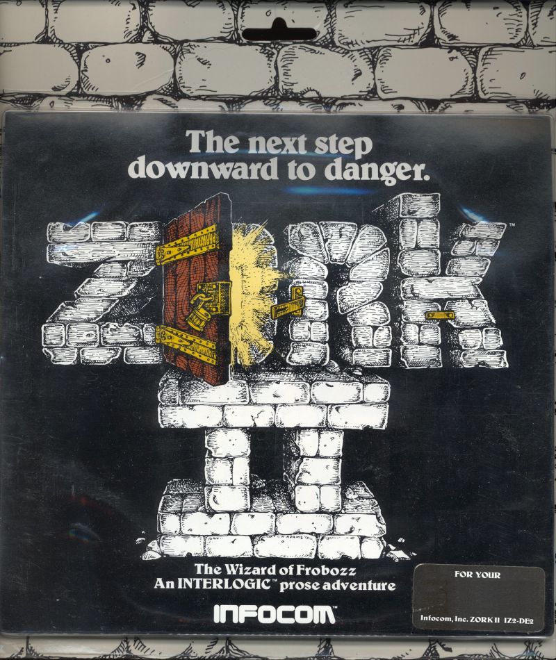
Box cover from Zork II

While the early z-machine had some pretty austere limits, some other limits were built into the Zork II experience by design. I’m thinking here of the inventory limit and the eternally damned light limit, which was even more frustrating here than in the previous game. I dunno, I suppose it’s possible that there was some technical root for the inventory limit, but it sure feels like it’s imposed in the name of some distorted sense of “realism”, a notion which flies out the window in dozens of other places throughout the game. Even if we accept the magic, the fantasy, and the allegedly underground setting (with features that feel less and less undergroundy all the time), there are just many things that make no physical sense, like easily scooping a puddle into a teapot. We can do that but we can’t carry however many objects we want to? (Again, Inform rode to the rescue here with the invention of the sack_object.)

That light limit, though. There’s no technical reason for it, and it caused us to have to restart Zork II TWICE. Not only that, it’s even crueler than its Zork I version, both because there is no permanent source of light in the game (unlike the lovely ivory torch from part 1) and because there are so many ways in which light can be randomly wasted by events beyond the player’s control. Chief among these are the Carousel Room and the wizard.

Zork I had a Round Room too, and it was entirely harmless. The Carousel Room is another story. It’s the kind of thing that sounds like a fun way to confound players, and it is, but in the case of my playthrough with Dante, we didn’t defeat it until very late in our time with the game — probably about the 75% mark of the time we spent on the game overall. That means a lot of our transcripts consist of us trying to go a direction, failing, trying again, failing, rinse, repeat, all the time ticking through that light limit, since of course all the rooms involved are dark. And it’s not as if the game makes it obvious what or where the puzzle to stop the room even is.

By itself, this direction-scrambling behavior would be quite annoying. When coupled with the fact that our light source is on an unalterable timer, it’s infuriating. Now add to that an NPC who can come along and waste your time with spells like “Float”, “Freeze”, or “Feeble”, all the time wasting yet more light, and you have one deeply frustrating game mechanic. This is that hallmark of early text games, where forced restarts were seen as adding to the “challenge.” A challenge to one’s patience, certainly. As before, Dante sat out those replay sessions.

>EXAMINE WIZARD

Since we’ve arrived at the topic, let’s talk about the Wizard of Frobozz. As has been extensively documented, Zork began life as a mainframe game, too large to fit into the microcomputers of its day, so when its implementors formed Infocom to sell it on the home PC market, they had to split up the mainframe game into pieces. That meant that the nemesis of the original game, the thief, appeared and was dispatched in the first installment of the home-version trilogy.

The thief was compelling. He could pop into your world at the most inconvenient times and create havoc, but you also couldn’t finish the game without him. With him gone in the first game, who would serve as the new adversary? Enter the Wizard. Dante was excited the first time the Wizard showed up — “It’s the title!” he said. The Wizard is a compelling character too — unpredictable like the thief but with a much larger variety of actions. He can cause a wide range of effects, but sometimes he screws up and doesn’t cause anything at all. Other times, he thinks better of meddling, and instead “peers at you from under his bushy eyebrows.”

When the wizard would show up, and the game would unexpectedly print out a stack of new text, our pulses would quicken, thinking that we’d stumbled onto something exciting. This effect reminded me to tell Dante about the days of external floppy drives — when I first played Zork II, the entire game couldn’t fit in the computer’s memory, so whenever something exciting was going to happen, the game would pause and the disk would spin up, so that the new data could be read into memory before it was displayed to the player. The excitement that accompanied that little light and whir — for instance, when leading the dragon to the glacier — was equal to any thrill I’ve subsequently gotten from a video game.

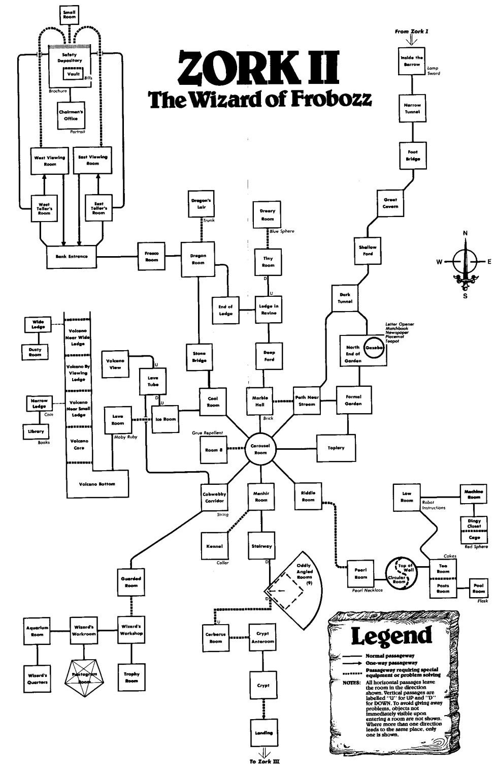
Map from Zork II

Of course, in the case of the wizard, it would turn out that nothing cool was happening. In fact it was just the opposite — we were generally about to get stymied in some amusing but nevertheless aggravating way. The wizard obviously gets more frustrating as he keeps repeating and repeating, but the variety and comedy in his spells, not to mention that sometimes he fails completely or casts something you don’t hear, really helps temper the annoyance. That said, this game is rich enough to encourage a flow state, and when the Wizard shows up to somehow block your progress, it really disrupts that flow.

Those blockages are ultimately detrimental to the game, on a level I doubt its authors were even thinking about. Parser IF is full of pauses — an indefinite amount of time can pass in between each prompt. However, the player is in control of these pauses’ length, and when we’re barreling through a game, either replaying old stuff to get somewhere or carried on the wings of inspiration, the pauses hardly feel like pauses at all. It’s more like an animated conversation. When the Wizard comes along, though, he’s a party-crasher who grinds that conversation to a halt. Suddenly we are being forced to pause, and cycle through more pauses to get through the pause.

Perhaps in some games, such a forced break would create contemplation, or an opportunity to step back and think of the bigger perspective. That wasn’t the case in Zork II, at least not for us. It just felt like our conversation had been interrupted, and we had to wait for the intruder to go away before we could continue having fun. This feels qualitatively different from the thief, whose arrival would shift the tension into another register, and whose departure may have resulted in loss of possessions, but never in paralysis that simply drained precious turns from an implacable timer.

On the other hand, the wizard has some excellent advantages over the thief. Infocom didn’t make the wizard part of the solution to a puzzle, the way the thief was, since that would have been redundant. In Zork I, the thief would foul up your plans, and had to be eliminated (though not too soon) in order to progress. Instead of this, Zork II themes its entire late game around fouling up the wizard’s plans. This conveys the sense that unlike the thief, the wizard has a separate agenda, one that isn’t centered around the player. That adds a small but significant layer of story to this game that isn’t present in its predecessor.

The way we frustrate the wizard is by getting into his lair, and doing so is one of the game’s most satisfying puzzles. The locked, guarded door to the lair starts with an arresting image: “At the south end of the room is a stained and battered (but very strong-looking) door. […] Imbedded in the door is a nasty-looking lizard head, with sharp teeth and beady eyes. The eyes move to watch you approach.” Getting past this door means disabling both the lizard and the lock, and each requires solving multiple layers of puzzles. For the lizard, it’s solving the riddle room, then finding your way to the pool, then figuring out how to drain it. For the key, it’s getting rid of the dragon, then rescuing the princess, then figuring out that the princess should be followed to the unicorn.

Then, of course, there’s the step of determining that the key and the candies are the necessary ingredients for the door. We tried many things before that! (In the process, we found one of the weirdest Infocom bugs I’ve ever seen — more about that in a moment.) And yet, even after solving it, we didn’t even have half the points! Experiences like this are what make Zork II feel so rich. Layering of puzzles, and then opening up an even bigger vista when they interlock, makes for a thrilling player experience.

Okay, so as promised, the weird bug with the lizard door:

Guarded Room
This room is cobwebby and musty, but tracks in the dust show that it has seen visitors recently. At the south end of the room is a stained and battered (but very strong-looking) door. To the north, a corridor exits.
Imbedded in the door is a nasty-looking lizard head, with sharp teeth and beady eyes. The eyes move to watch you approach.

>look through mouth
You can't look inside a blast of air.

>examine air
There's nothing special about the blast of air.

A blast of air??? What in the world is this? Dante and I never figured it out. There’s never a blast of air anywhere in the normal course of gameplay that I can find. Yet there it is in the Guarded Room, invisible but waiting to be found, apparently as a synonym for “mouth”. It gives all the usual stock responses — e.g. “I don’t think the blast of air would agree with you” as an answer to “EAT AIR”, but is simply inexplicable. Stumbling across it was one of the weirder moments I’ve ever had with an Infocom game.

There were some other amusing bugs as well:

>put hand in window
That's easy for you to say since you don't even have the pair of hands.

>roll up newspaper
You aren't an accomplished enough juggler.

>throw bills at curtain
You hit your head against the stack of zorkmid bills as you attempt this feat.

>put flask in passage
Which passage do you mean, the tunnel or the way?

We played the version of the game released in Masterpieces of Infocom — at the time that compilation was released, Zork II was 14 years old, and had sold hundreds of thousands of copies. The fact that these bugs remain is a consolation to every IF author who eventually abandons a game, its final bugs unsquashed.

Screenshot from the opening screen of Zork II

>EXAMINE PUZZLES

Blast of air notwithstanding, that lizard door isn’t the only great puzzle in Zork II. The hot air balloon is another all-time winner. Figuring out the basket, receptacle, and cloth is fun, but once the balloon inflates, its ability to travel within the volcano feels magical. That balloon/volcano combo is one of the most memorable moments in the entire trilogy, and the whole section — including the bomb, the books, and the way it ties locations together — is a wonderful set piece.

The dragon puzzle is another great one. For us, it wasn’t so much a “How can we lead the dragon to the glacier” as it was a “Whoa, the dragon is following us. Where can we go?” I quite like that Zork II allows both of these routes to arrive at a solution. The placemat/key puzzle, while less flexible, is brilliant too, though it feels rooted in a time when people would have seen keyholes that a) could be looked through and b) might have keys left in them. Such a real-world experience was simply not in Dante’s frame of reference. In fact, I remember struggling with that puzzle when I was a kid, too — my dad stepped in and helped me with it, possibly aided by having lived in the kind of house where this could be a legitimate solution to an actual problem.

There are also some lovely structural choices in Zork II. The sphere collecting and placement is a great midgame — getting each one is exciting, and putting them on the stands feels appropriately climactic for the end of the second act. Similarly, the demon is a good creative variation on Zork I‘s trophy case, one who offers a marvelous sense of possibility once he’s satisfied.

We tried a variety of things with his wish-granting power, some rewarded and some not. We focused at one point on the topiary, one of the most enticing red herrings in the trilogy. We kept thinking there must be something to do with it. But “demon, destroy topiary” and “demon, disenchant bushes” got us nowhere. On the other hand, “demon, kill cerberus” was rewarded with comedy, if not progress:

“This may prove taxing, but we’ll see. Perhaps I’ll tame him for a pup instead.” The demon disappears for an instant, then reappears. He looks rather gnawed and scratched. He winces. “Too much for me. Puppy dog, indeed. You’re welcome to him. Never did like dogs anyway… Any other orders, oh beneficent one?”

Our first successful try was “demon, lift menhir”, which certainly got us where we needed to go, but much more wondrous was the notion of the demon granting us the wizard’s wand. Several times, Zork II had given us that wonderful IF experience of a broad new vista opening in response to overcoming some obstacle — the balloon and volcano is a prime example, as are the riddle and the Alice areas. When we obtained the wand, it felt like another whole range of possibility opened up. This sense eventually shrank, of course, but it didn’t fully go away either. For one thing, just the ability to “fluoresce” things and end our light source torture felt like a miracle. Of course, it screwed us up for the final puzzle, but more about that a bit later.

We also tried “demon, explain bank”, which didn’t work, but I sure wish it would have. As had many adventurers before us, we struggled mightily with the Bank of Zork. We eventually blundered around enough to get through it, but at no point did we feel a flash of insight about it, or an epiphany of understanding. I hesitate to call this an underclued puzzle. I think it’s just bad — maybe the worst puzzle in the trilogy. Dave Lebling later revealed that even other Infocommers couldn’t keep it straight.

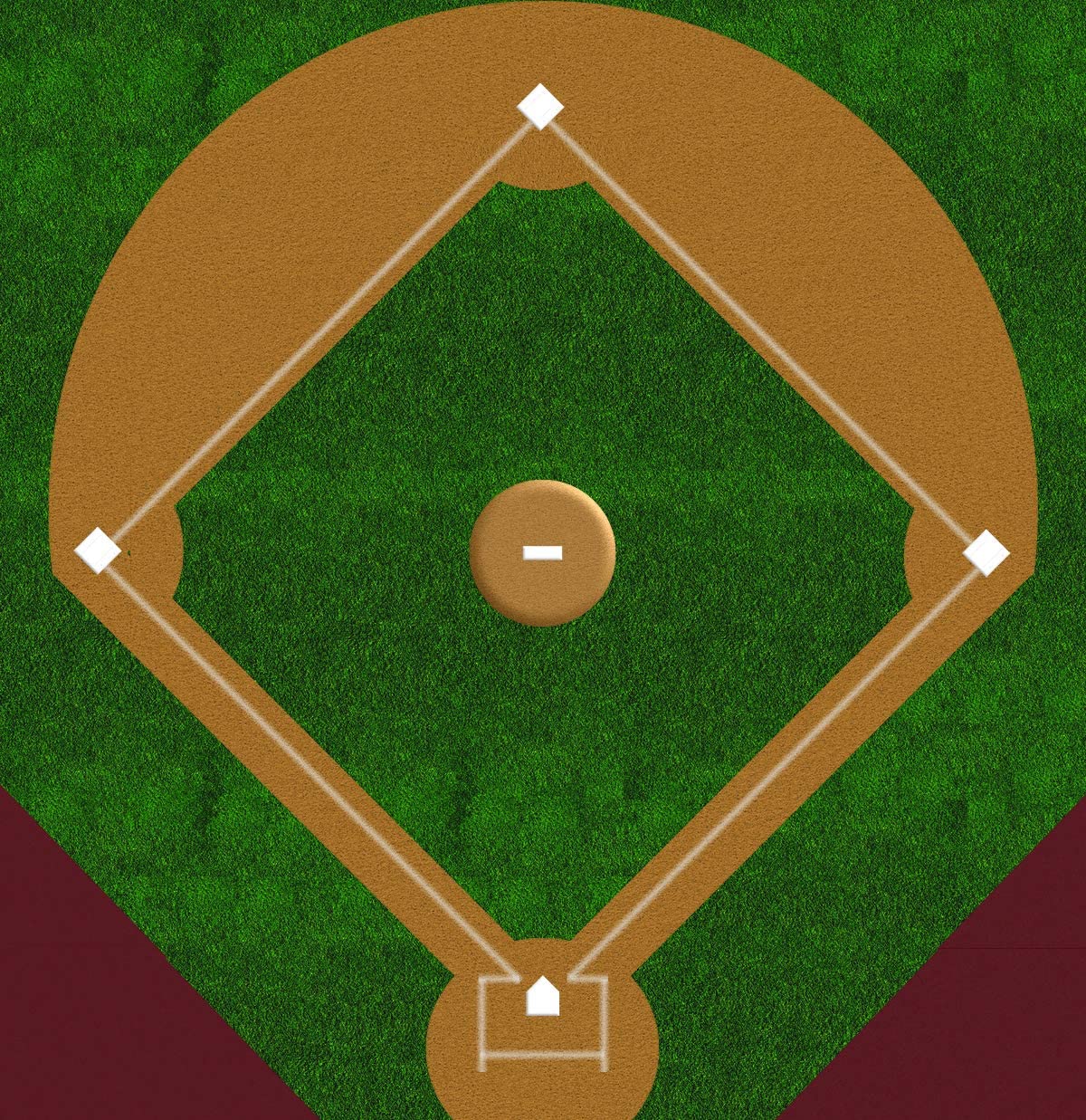
The oddly-angled rooms are another infamous Zork II puzzle, in this case infamous for requiring knowledge of baseball in a way that excluded non-Americans. I contend, though, that this isn’t even the worst part of the puzzle. Even if you do understand baseball, and even if you do make the connection between those rooms and a baseball diamond, the puzzle is still unreasonably hard to solve. Say somebody told you in advance that this is a baseball-themed puzzle, and that to solve it you’d have to traverse through the rooms like you’re running the bases. What would you do? If you’re anything like me, you’d envision the typical diagram of a baseball diamond. It looks like this — the first hit on a Google image search for “baseball diamond”:

Diagram of a baseball diamond

If you conceive this diagram as an IF map, the pitcher’s mound is north of home plate, and the other bases extend in cardinal directions from the mound. So starting at home plate, to run the bases, you’d go: NE, NW, SW, SE. Right?

Well Zork II, for reasons I don’t understand, tips the diamond on its side. To run the oddly-angled bases, you have to pretend that home plate is west of the pitcher’s mound, and therefore travel SE, NE, NW, SW. That reorientation delineates the difference between “Oh, ha, it’s a baseball diamond!” and “How in the hell is this a baseball diamond?” So take heart non-Americans (and Americans who don’t know the first thing about baseball) — that “inside baseball” knowledge isn’t nearly as helpful as you might think.

The other puzzle that really stymied us was the riddle. For those who haven’t played in a while, the riddle is this:

What is tall as a house,
round as a cup,
and all the king’s horses
can’t draw it up?

This was an interesting one for me to observe. I remember solving it quite readily when I played Zork II as a kid. For whatever reason, the words just clicked for me. Dante, on the other hand, really grappled with it. He took about thirty different guesses over the course of our playthrough before I started feeding him hints. The guesses fell into a few different categories:

    • Contrived answers: a gigantic egg, an osmium sphere (because osmium is so dense)
    • Jokey reference answers: the Boston Mapparium (an enclosing stained-glass map globe that he learned about from Ken Jennings), an enemy city support pylon (referencing The City We Became by his fave author N.K. Jemisin), a geode (from the same author’s Broken Earth trilogy)
    • Logical guesses, albeit not very Zorky ones: power pole, pipe, subway
    • References to this game or the previous one: rainbow, tree, menhir, dragon, xyzzy, the letter F, barrow, glacier, carousel, lava tube, gazebo, cerberus, balloon, hot air balloon, cave, carousel room, mine, coal mine
    • Just off-the-wall pitches: hill fort (a Celtic thing inspired by “barrow”), tentacle, squid, octopus

Finally I started hinting around pretty heavily to think about holes in the ground, but even then he said “hole”, “bore hole”, and “quarry” before he got to “oil well”, which wasn’t even the game’s intended answer but which still provoked the success response because it contained the word “well”.

Riddles have a big risk/reward proposition as an IF puzzle. If you solve one, you feel so chuffed and clever. But if you don’t solve it, you may just be stuck, especially in the absence of any other hinting mechanism. Perhaps in the days where players were willing to sit with stuckness for extended periods of time, the calculus was a little different, but now puzzles like this flirt with ragequit responses, which I would argue has turned into a failure on the game’s part.

The final puzzle of Zork II felt like a mixed bag to us. It’s intriguingly different from Zork I, which basically led you to the ending after you’d deposited all the treasures. In Zork II, you can get all the points but not be finished. Indeed, the response to “SCORE” at this point is:

Your score would be 400 (total of 400 points), in 753 moves.
This score gives you the rank of Master Adventurer, but somehow you don’t feel done.

There’s one more puzzle to solve, and for us it was difficult enough to require a hint, something we’d managed to avoid for the rest of the game. Nevertheless, we ended up satisfied, feeling that it was tough but fair — essentially it requires being lightless, something that willingly surrenders in the battle we’d been fighting the whole game. We completely missed the hint — a fairly obscure phrasing on a can of grue repellent — and therefore floundered.

For us, the barrier to solving this puzzle was the flip side of the sense of possibility that the wand allows. For example, the ability to make things fluoresce with the wand so fascinated (and relieved) us that we never walked in there without light. Our continued frustration with light limits also made this behavior very enticing. On top of that, it seemed like no coincidence that “Feel Free” was a double-F, like a more powerful version of the wizard’s spells. Oh the number of places where we pointed the wand and incanted “Feel Free”, to no avail. On the other hand, having solved this puzzle with hints prepped us to solve on our own a very similar puzzle in Enchanter, but that’s a topic for another post.

I think I’ve spent more time in this post criticizing Zork II than I have singing its praises, so it may be surprising when I say that this is my favorite game of the trilogy. I have plenty of affection for parts 1 and 3, but to me this is where the best parts of Zork fully jelled. The humor works wonderfully, the imagery is fantastic, and the structure mixes richness and broadness in a way that makes for wonderful memories of gaming excitement. And sure, its bad puzzles are bad, but its good puzzles are great — deeply satisfying and marvelously layered. Zork I established the premise, and Zork III deconstructed it, but Zork II fulfilled it, and in the process provided me with many happy hours that I loved revisiting with Dante and his fresh eyes.

Till Death Makes a Monk-Fish Out of Me! by Mike Sousa and Jon Ingold [Comp02]

IFDB page: Till Death Makes a Monk-Fish Out of Me
Final placement: 2nd place (of 38) in the 2002 Interactive Fiction Competition

Oh, hallelujah. All through last year’s comp, I kept waiting for a game to come along that I loved enough, and found few enough flaws in, that I could rate it 9.5 or above. It never happened. While there were some excellent games last year, none of them felt to me like they’d entered that rarefied air occupied by past games like Shade, Babel, or Delusions. This year, after going through 25 games, the same thing was happening. Until now.

Despite its somewhat unpromising title, TDMAMOOM is a fantastic game through and through. How do I love this game? Let me count the ways. Okay, first, there’s the writing. Frankly, I could spend the entire review talking just about the writing, it’s so great, so I’ll restrict myself to just a few examples picked more or less arbitrarily. There are numerous instances of excellent foreshadowing, whether of themes or puzzles — in the former case, they add great pleasure on re-reading, and in the latter case they operate as a delightfully subtle but effective hint system. The room descriptions are masterfully done, drawing from an endless well of cleverness to make the typical exit listing sound fresh and interesting. Best of all, the writing in this game is just flat-out funny, sometimes howlingly so. Just one example of many — looking at a palm scanner after you’ve switched bodies with an NPC:

>x panel
Flat black glass, a panel that uses all manner of fancy beams to read
over your palm-print and check you are who you think you are.
Unfortunately, it's not clever enough to realise you now think you
are someone that you actually aren't. Or you think you are someone
who you're not, but really are. Or something like that. Anyway, it's
a pig-ignorant machine.

I love it when an IF game makes me laugh out loud, and that happened frequently in this game.

Then there’s the coding. This coding is good. Really good. A raft of nonstandard verbs get recognized and handled. There are a variety of special commands provided, such as “R” or “REVIEW”, which repeats the room description without using any game time. Descriptions of rooms, objects and events alter themselves in various subtle and blatant ways, depending on what’s come before. Timed events, even events where a huge amount is happening at once, run smoothly along their tracks with nary a glitch. There’s a very fine adaptive hint system, quite sensitive to situation and even possessing a self-destruct capability that removes the blatant walkthrough answers after the comp period has ended. Library messages adapt seamlessly to the PC’s situation and point-of-view.

Oh, and how could I forget the special effects? TDMAMOOM takes control of the interpreter to create a beautiful Infocom/Inform-style look-and-feel; people who don’t care for the general appearance of TADS games should definitely try this one. The game even features a little bit of sound, throwing in a system beep at an appropriate time.

Working with the coding and the writing to propel this game to greatness, the story is killer, a wild thrill ride through surprises small and large. Like its predecessors Delusions and Babel, TDMAMOOM takes place in that most favored of IF locales, an isolated scientific research station. I won’t even get into the plot here, because players should experience it for themselves with as few spoilers as possible up front, except to say that it all fits together very nicely, and every time I had doubts, the game anticipated them and tied up the loose ends.

Along with all this, just a quick word about the puzzles: many of them are not only inventive but pitched at just the right level of difficulty, providing several of those wonderful “aha!” moments for me. Some of them are rather complicated, but they’re always scrupulously fair. I ended up turning to the hints so that I could see more of the game before time ran out, but I think if I’d had the time available, this game’s puzzles would have rewarded me for spending it.

So we’re talking about a pretty phenomenal game, here. In fact, almost depressingly so, given that I’m an entrant this year and TDMAMOOM is miles better than my game. It’s not perfect, mind. I found a few spelling and grammar errors, and there were times I wished for clearer descriptions of events and objects. But those flaws are minor and cosmetic, and they do nothing to change the fact that this is a damn good game. Bravo.

Rating: 9.8

Sun and Moon by David Brain [Comp02]

IFDB page: Sun And Moon
Final placement: 21st place (of 38) in the 2002 Interactive Fiction Competition

Sun And Moon is a strange beast. It certainly isn’t a text adventure, not even one of those multiple-choice web text adventures we’ve seen in previous competitions. Instead, it’s something altogether more interesting. After the manner of the ingenious online promotional campaign for Steven Spielberg’s movie A.I., Sun And Moon draws us into its story through a conglomeration of web sites — diaries by fictional characters, press releases by fictional companies, and so on. To a degree, this works pretty well. The weblog really looks like a weblog (it’s even on angelfire.com, pop-up ads and all), and the personal websites of the other characters are convincing too. They all mix links to actual sites with links that extend the fiction, thereby significantly blurring the boundary between the story and the world.

The game even provides email addresses for the characters. I tried writing to these to see if I’d at least get an autoresponse, but alas, it wasn’t to be. The company web site stretches credulity a bit, especially the “here’s where I’ll bitch about the boss, because I’m sure he’ll never read it” section — only the very confrontational or the very stupid would actually do such a thing on their own company’s website. Still, the overall effect of these narrative elements is absorbing; the fictional pieces of Sun And Moon are strong.

The interactivity is another matter. Certainly, there’s a degree of interactivity to following links from one web site to the next, but given that pretty much all the fictional content of those sites is just static text, that interactivity is only a shade greater than turning the pages of a book. Instead, Sun And Moon provides the vast majority of its interactivity in puzzles that bear almost no direct relationship to the story itself.

It seems that several of the characters in the story are puzzle enthusiasts (mazes and cryptic crosswords), and offer puzzles of their own creation via their web sites. Oh sure, some small element of the solution to these puzzles relates back to the story, but for the most part they are puzzles for their own sake. One could certainly argue that there are plenty of text adventures for which the same is true, and it’s interesting to think about where this game sits on the interactivity spectrum when compared to pure puzzle games like Color And Number. Nevertheless, it was my experience that the story and the interactivity in Sun And Moon sat alongside each other in ungainly halves, a narrative quite literally alongside a crossword, joined by tendrils that were tenuous at best.

Centaur works like this certainly add spice to in the ongoing debate about defining the term “interactive fiction.” In fact, I’m inclined to predict that Sun And Moon will spark a bit of a debate over just what sort of works belong in the competition. Personally, I wouldn’t bar works like this one from the comp — I’d rather have a wide definition of IF than a narrow one, and at several points in the game I was excited not just by its content but by the possibilities its form suggests. Then again, it doesn’t have all that much in common with a regular text adventure, and it almost seems unfair to rate it alongside TADS and Inform games.

So I’m in a quandary. On the one hand, my ratings tend to be based on how much I enjoyed the experience of a particular game, and I enjoyed the experience of Sun And Moon a fair amount. On the other hand, much of that pleasure wasn’t due to Sun And Moon itself, but rather because it introduced me to the fascinating form of cryptic crossword puzzles, and because it inspired me to think about what sort of stories might be created using these media. In addition, for me there is no way this game could have fit into two hours (though some portion of my time was devoted to teaching myself about cryptic crosswords), and consequently there’s a great deal of it I haven’t seen or solved.

What I did see provided an interesting story and some neat puzzles, but not what I would call an immersive fictional experience. Rather than being a fully realized piece of web IF itself, Sun And Moon feels more like a signpost to some very interesting territory ahead.

Rating: 7.3

Color and Number by Steven Kollmansberger [Comp02]

IFDB page: Color and Number
Final placement: 24th place (of 38) in the 2002 Interactive Fiction Competition

Color And Number belongs to that genre of IF I’ve begun to call “pure puzzle games” — oh sure, it’s got a shred of plot, something about investigating a cult that worships colors or something, but that’s more or less overwith before the first move, and from that point forward, you’re pretty much in a pure puzzle landscape. And yes, those puzzles are keyed to a particular theme — you guessed it: colors and numbers. True to the precedent established in Comp01 games like Elements and Colours, the game even names itself after its puzzle theme.

About twenty minutes into this thing, I knew I didn’t have a prayer of finishing it in two hours, so I played until I hit the time limit and then stopped. Thus, in fairness, I don’t know whether the story makes a strong resurgence towards the end or anything, but even if it does, this game clearly belongs to the puzzles. Those puzzles are of the sort that prompts lots of note-taking, charting the correspondences between the various pieces the game teasingly doles out. I enjoyed several of these brain-twisters — they have a mathematical elegance, and some of the best ones suggest their solutions quite organically, which is a pleasure.

Others, though, are a little more imperfect. One puzzle in particular stumped me even though I had looked at all the hints for it, and I think there are several reasons for this. First, the feedback level was too low. The puzzle involved performing a string of actions, but without close investigation, the environment betrayed no particular indication about which actions were successful or useful. It’s not that this feedback was entirely absent, but it wasn’t prominent enough for me to even notice until long after I had looked at the answers.

Secondly, the sequence has a bug in it. It’s just a TADS error (one which oddly didn’t show up in my game transcripts, so I can’t quote it) — not enough to prevent the solution from working properly, but more than enough to drain my confidence in the puzzle’s correct implementation. Between that and the lack of feedback, it’s pretty clear how I ended up looking at hints, but even after I had seen them all, and ostensibly solved the puzzle, nothing happened.

I found out, through trawling Google for hint requests, that this was because I needed to do some other actions in an entirely unrelated area. This is not good puzzle design — at the very least, solving that portion should have yielded some noticeable change so that I could understand that my attempt had in fact worked, even if it wasn’t producing any useful revelations until its counterpart pieces were in place.

Critics like me talk a lot about how difficult it is to pull off combining an arresting story with interesting puzzles, but what’s becoming clearer is that even when IF eschews story altogether and focuses solely on puzzles, it presents considerable challenges to its creator. Little prose errors and formatting issues aren’t so noticeable in a work like this (unless they severely cloud meaning), but even tiny feedback or implementation errors can be devastating. Because there’s no story to distract us from game bugs, they loom very large indeed, and as soon as one crops up, it drastically affects the dynamic between player and game. Suddenly, a struggling player ceases to believe that he’s stuck because of his own inability to solve the puzzle, and starts to suspect that game defects are making the puzzle unsolvable, because after all, if bugs crop up in one place, they can be elsewhere too.

Infocom and its contemporaries had a big advantage in this area — if you bought a game off the shelf, knowing that the resources of a full-fledged company had been used to quality test it and that it had been reviewed by major publications, you could be relatively confident that whatever bugs still might lurk within it wouldn’t be enough to prevent you from solving its puzzles. No such assurances exist for an amateur, freeware IF comp game, and consequently pure puzzle games must be fanatically assiduous about debugging and testing. That’s not an easy mark to hit.

Rating: 6.7

Concrete Paradise by Tyson Ibele [Comp02]

IFDB page: Concrete Paradise
Final placement: 30th place (of 38) in the 2002 Interactive Fiction Competition

I read stuff in the IF Comp that I just don’t read anywhere else, and this game is a perfect example. You start out, apparently, as a junk-food obsessed child, whose mission in life is to find and eat candy. Then suddenly, a horde of screaming authority figures pops up. After a short, dreamlike sequence, you end up in an island prison, where everything is dark, rusted, and filthy. A stranger wanders in, offers an implement of violence, and wanders out again. Your escape process includes expedients ranging from the obvious (a message in a bottle) to the rather surprising (self-mutilation and brutal murder). Then some puzzly stuff, more dreamlike unreality, more screaming authority figures, more obvious escape techniques, more grime, an enormous phallus, an overwhelming ocean, and eventual success tinged with isolation. In short, it’s quite a bit like wandering around inside the id of a mentally and emotionally stunted paranoid psychopath.

If this effect served some artistic purpose, or indeed if it even seemed intentional, there might be a lot to admire about it. Alas, this is not the case with Concrete Paradise. Instead, the game feels like a stream-of-consciousness exercise, in which the PC is placed in one stock situation after another, whose solutions range from the extremely obvious to the head-scratchingly odd. There are a lot of telegraphed puzzles, by which I mean that the game tells you early on how to escape a particular situation, and then when you are in that situation, you escape it with the recommended method. Other puzzles involve waiting around doing nothing in particular until the game solves the puzzle for you. The storyline veers wildly from innocent childhood hijinks to some very dark stuff indeed, but never seems to have any overarching plan or direction in mind.

Most of the time, games with this sort of schizophrenic, unconscious tone tend to be riddled with errors, and this game is no exception. The “about” text makes an emphatic point about how the game has been tested on a variety of TADS interpreters, but one wonders whether that time might have been better spent ferreting out the numerous spelling and grammar errors, not to mention the programming bugs. Guess-the-verb problems abound, along with actions that prompt no response, actions that can be done repeatedly without cumulative effect, and other classics. Even if none of these technical problems were present, though, this still wouldn’t be a good game. A good candidate for psychoanalysis, maybe, but not a good game.

Rating: 3.6